Where to Start with Excel Data?
Many businesses keep their data in Excel, but transforming this data into meaningful charts and dashboards can be a time-consuming, technically demanding process. The AI-powered chart wizard reduces this to seconds.
Step 1: Upload Your Data
Drag and drop your Excel or CSV file. The platform automatically detects column types, recognizes date and number formats, and flags missing values. No pre-processing or data cleaning required.
Step 2: Tell AI What You Want to See
Write in plain language: "Show sales trends for the last 12 months" or "Compare the top 5 selling products." AI analyzes your data, selects the optimal chart type, and instantly creates the visualization. You get interactive Plotly charts — with filtering, zoom and detail view included.
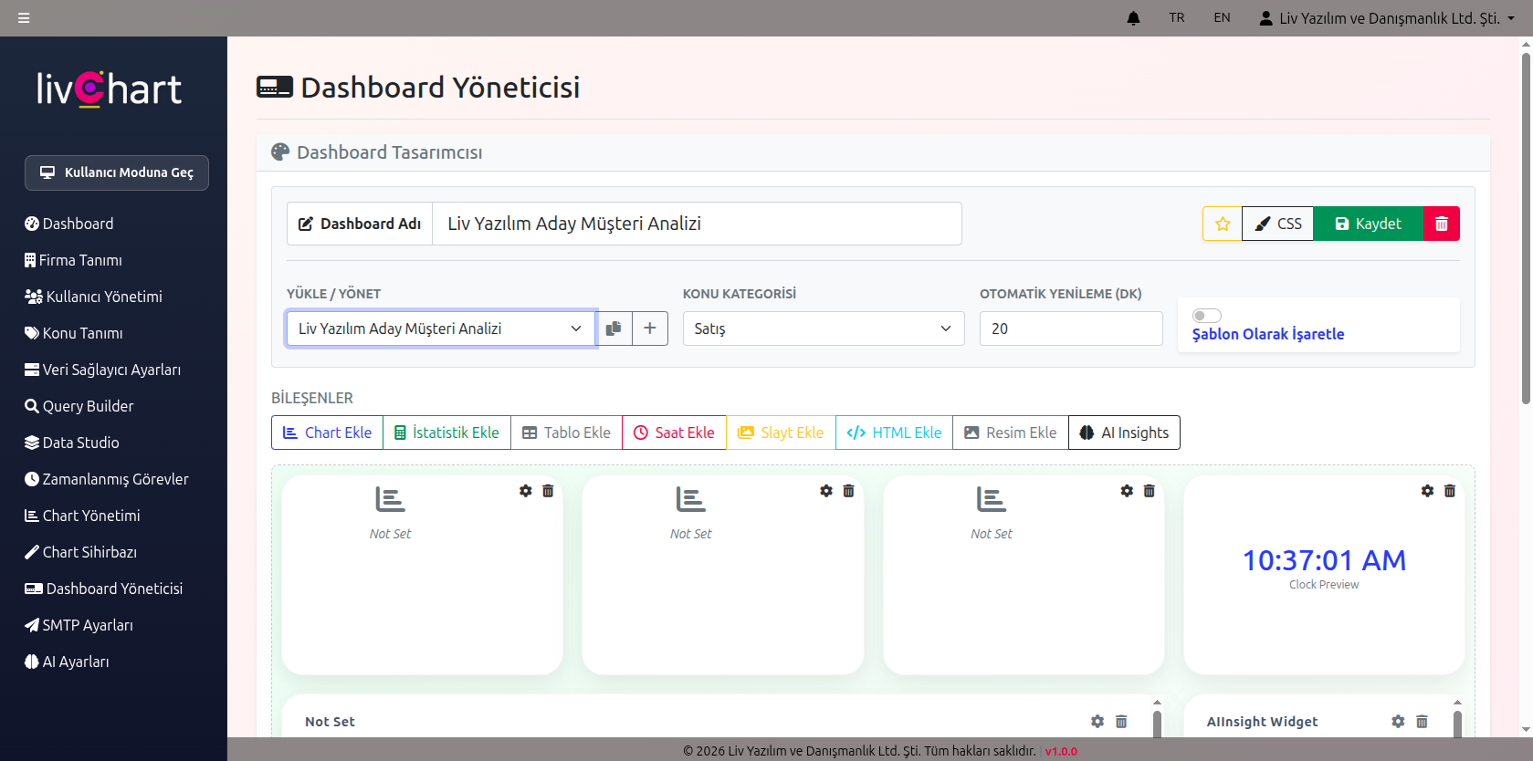
Step 3: Assemble Your Dashboard
Drag and drop your charts to design a customized dashboard. Add statistics cards, target lines, and live AI summary modules. Export your dashboard as PDF or keep it updated with scheduled automation.